

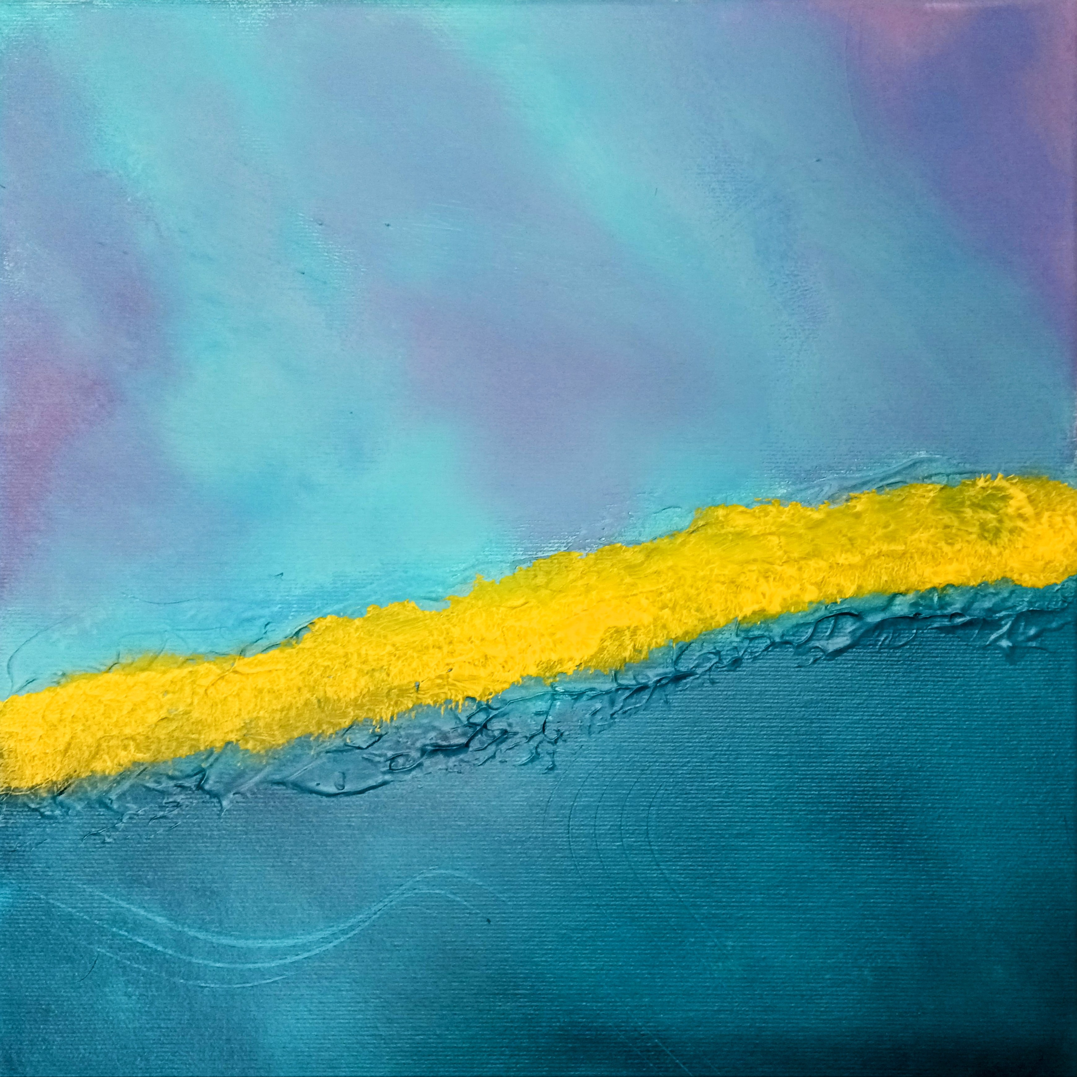
Let’s dive into color theory and make choosing your color palette as enjoyable as binge-watching your favorite show.
Choosing the perfect color palette for your artwork can feel like trying to solve a puzzle with too many pieces, but don’t panic—color theory is here to help. While it may seem intimidating, understanding the relationships between colors can make your creative process much easier (and a lot more fun). Whether you’re an abstract artist, a painter, or a designer, knowing how to pick the right colors can elevate your work to a whole new level.
1. The Color Wheel: Your Personal Art GPS
The color wheel is like the friendly map of the color universe. It organizes primary, secondary, and tertiary colors in a neat little circle to show how they relate. You’ve got your trusty primaries: red, blue, and yellow—like the Power Rangers of the color world. Mix them together, and you get the next level of colors: secondary colors like orange, green, and purple. Feeling fancy? Blend a primary and secondary, and voila, you’ve got your tertiary colors.
But here’s the kicker: this wheel isn’t just about pretty colors; it’s about relationships—who gets along and who’s clashing at the color family reunion. Understanding these relationships will help you choose a harmonious color palette that works for any project.
2. Color Schemes: The Matchmaking Process
Once you’ve got the color wheel down, it’s time to think about color schemes. Think of this like color dating—certain combinations work beautifully, while others might lead to some awkward tension.
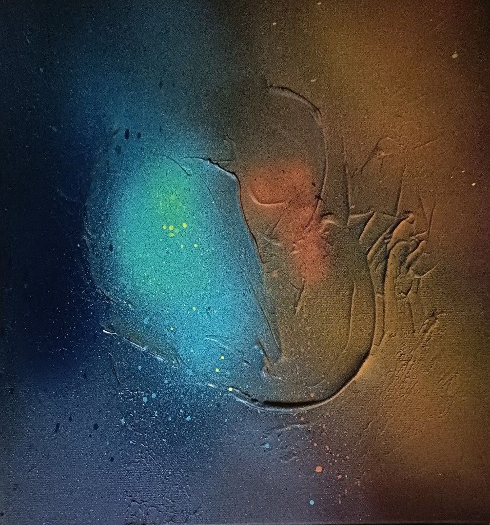
- Monochromatic: This scheme uses different shades of one color. It’s like saying, “I’m going to wear all black today, but make it fashion.” Simple, chic, and never overwhelming.
- Analogous: These are the colors that hang out together on the wheel, like blue, blue-green, and green. They get along because they’re basically cousins—similar but not identical. This creates a calm, pleasing aesthetic without being too matchy-matchy.
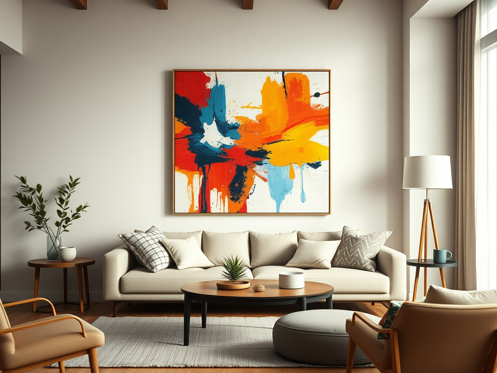
- Complementary: Opposites attract! Complementary colors sit across from each other on the wheel, like red and green or blue and orange. They create a high-contrast, high-energy look, like two best friends who couldn’t be more different but still bring out the best in each other.
- Triadic: This is your triple-threat color scheme—three colors equally spaced on the wheel (like red, blue, and yellow). It’s bold but balanced and can make your work pop without feeling like a rainbow explosion.
3. Using Color to Set the Mood
When picking a color palette, think about the vibe you’re going for. Want something energetic and fun? Maybe something calm and relaxing? Colors have this magical way of affecting emotions, so consider the psychology of color when making your choices:
- Warm colors (reds, oranges, yellows): These are the life of the party. They bring energy, passion, and excitement. Perfect for making your work stand out and grab attention.
- Cool colors (blues, greens, purples): The chill group. They bring relaxation and calm vibes. Use these when you want to create a peaceful, tranquil scene.
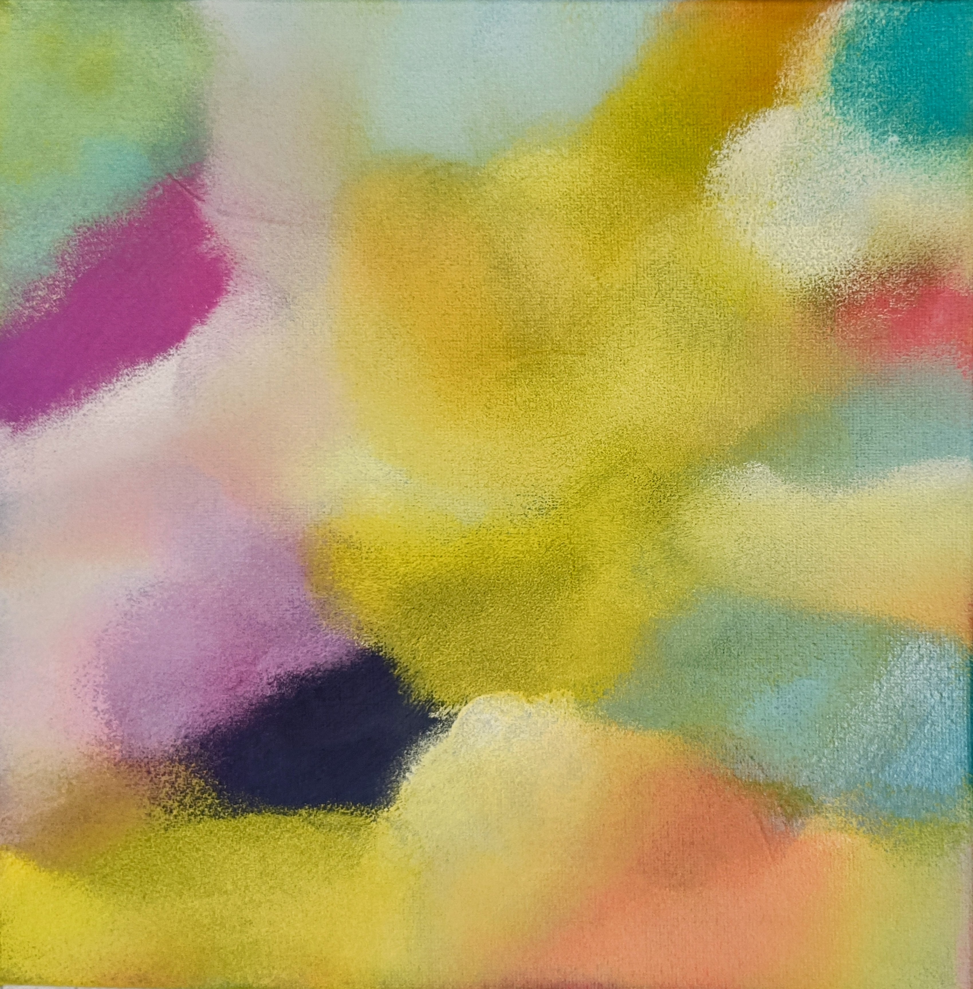
- Neutrals (black, white, gray, brown): Think of these as the peacemakers. They tone things down and give you space to breathe. Neutrals are great for balancing out bold, vibrant colors.
4. Don’t Overdo It: Finding Balance
While it’s tempting to throw every vibrant color onto your canvas, less is often more. Too many bright colors can overwhelm the eye and make your work feel chaotic. Balance things out by mixing vibrant hues with more muted tones or neutrals. Think of it like making a meal—yes, you want the flavor, but you don’t want every spice in the cabinet fighting for dominance.
5. Test Your Palette Before Committing
Before jumping in, try testing your color palette on a small area of your canvas or project. How do the colors interact? Does the mood feel right? Are they creating enough contrast or harmony? Sometimes what looks great in theory doesn’t work in practice, so give yourself room to adjust.
6. Use Digital Tools to Experiment
Not ready to dive into real paint just yet? That’s where technology comes in handy. There are plenty of digital tools to help you experiment with different color schemes. Tools like Adobe Color or Coolors allow you to play around with palettes and see how different colors work together before committing to a brushstroke.
7. Break the Rules (Responsibly)
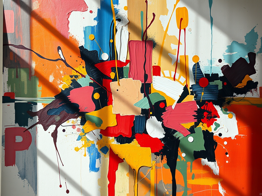
While color theory is a great guide, don’t be afraid to break the rules and experiment. Maybe you want to pair neon green with pastel pink—why not? Sometimes, the best color palettes come from pushing boundaries and going with your gut. Just make sure the overall composition doesn’t feel like chaos unless that’s what you’re going for (in which case, go wild).
Conclusion: Embrace the Power of Color
Choosing the right color palette is an art in itself, but with a little understanding of color theory, it doesn’t have to be overwhelming. Whether you’re using a bold complementary scheme or a peaceful analogous palette, the key is to use color intentionally to enhance your work. So go ahead—grab that color wheel, pick your palette, and create something amazing! the color wheel, your palette tools, and, most importantly, your artistic flair. Happy painting!

Leave a Reply